Meet Luminar AI Banner

Luminar AI Review Part 2 – Templates

OK, now that you have your images in LuminarAI via the Catalog, on to the next section.

Templates

Templates in LuminarAI are what use to be called Looks in Luminar. In other programs they may be referred to as presets. But basically they all do the same thing. They are a pre-set set of settings that you can apply to your image to give it a certain look.

Getting started with Templates. Select the image you wish to work in in the Catalog, then click the Templates menu at the top of the window will bring you to the Templates view
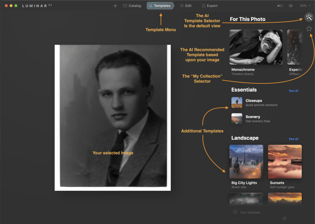
Templates in Luminar AI. The menus and sections
The Templates Section Layout

As you can see from the above, this layout has several sections, but the default view you are brought to is the Templates with the recommended AI template collections shown at the top of the Templates menu. Below the AI Template section are other categories of Templates that you may choose to use and those include.
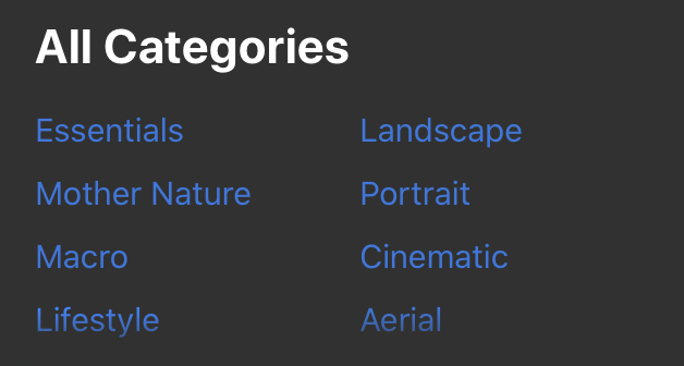
Template All Categories Menu
The Template Categories of Templates that come with Luminar AI

The top right of the window contains the Template Collection that Luminar AI has recommended based upon the photo that you had selected. In my example you will note that it recommended the “Monochrome” Template Collection as one it things I should like to try with this image. I suspect it choose this collection first since this is a Black and White image. There are additional recommended template collections to the right of the Monochrome Collection and to view those, you swipe to see the additional recommended Template collections.

My Collection

The Star below the “Magic Wand“ as I’m calling it is the “My Collection” menu selector. In this section, you will see any templates that you have marked as your favorites, any that you have purchased via Luminar Marketplace, User Templates (Those that you have created yourself, Yes you can do that), and lastly, Legacy Templates. The Legacy templates are where you will find any templates you have from the previous version of Luminar that are compatible with Luminar AI. Most seem to transfer in my case, but any that use depreciated tools that are no longer in LuminarAI will not transfer and would not be shown.
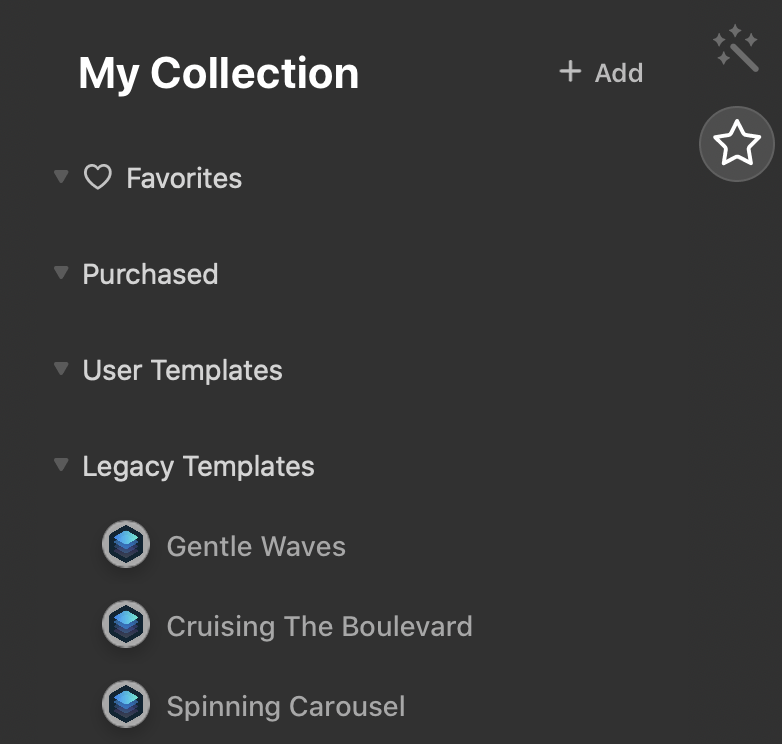
My Collection Templates
My Collections Menu

I’m still deciding on my new favorites, I haven’t purchased any yet, and have yet to create any myself, but you can see I have several Legacy Templates to go through in my “My Collections” menu. I’m not sure yet if LuminarAI will use any of these in the recommended Templates yet, but I suspect not. My thinking there is the newer template collections probably have additional information as part of the collection that is used the AI when determining if it is a good fit. That and I have several templates that are shown in my Legacy Templates section that are good for Black and White images and they were not included in the recommend Template collections section. If I find out otherwise, I’ll update you here.

Template Collection

Once you decide on a template collection to use, you now get to choose the specific template from that collection. Each will have its own settings and a slight variation or adjustment, That’s what makes them their own template. but have the same general theme, thus the collection.
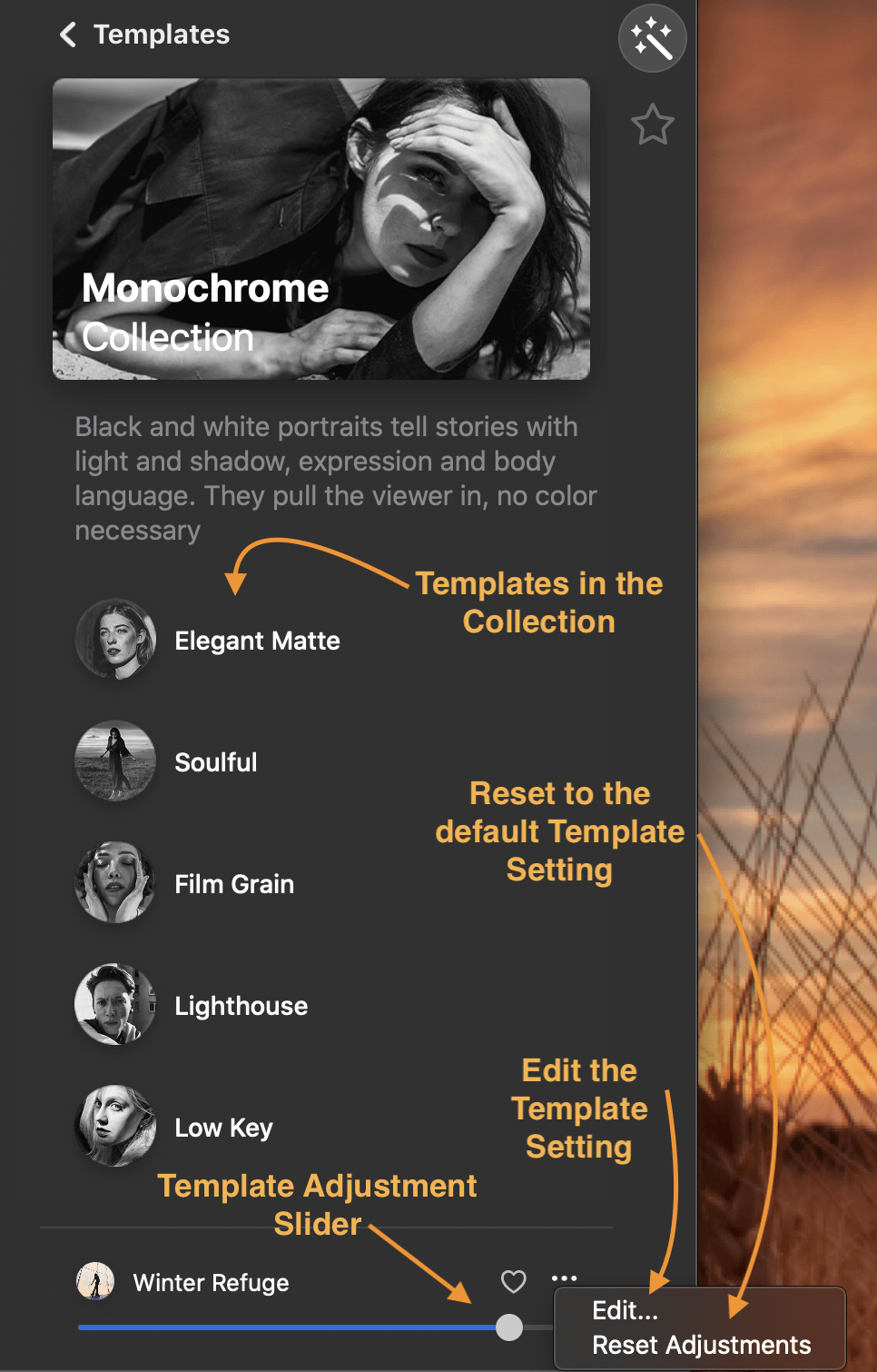
Template Collection Description of Menu/sections
Template Collection

Above is the view of the Monochrome collection that was recommended for my image. In this collection there are 5 templates. To see your image with each template, all you need to do is click on each template and LuminarAI immediately applies the templates settings to your image.

Be sure to slide the adjustment slider to see if your image looks better with a bit less of this template applied. This is one feature of LuminarAI and for that matter, other Skylum programs that I’ve always liked. When you select a template, the effect is shown at 100%. I’ve often found templates that I like but I sometimes do not like the effect at 100% so I just slide the slider to the left to back it off a bit.

And if you don’t like the template applied, you can select another, or just choose the Reset Adjustment to go back to your image without adjustments. You know if a template has been applied as the name of the template will show at the bottom right of the window. If no template is applied, there will be no name listed, just a grayed out “Your Template”

And out goes without saying, you don’t have to just use the template collection that the AI recommends, There is many more template collections included and you can always use on of the templates included with them.

Editing a Template

Now if adjusting the slider still doesn’t get you the look you want, you can still use that template as a base. Choose Edit in the template’s menu in the bottom right to see the adjustments made in this template and to make additional changes to get the look you want.
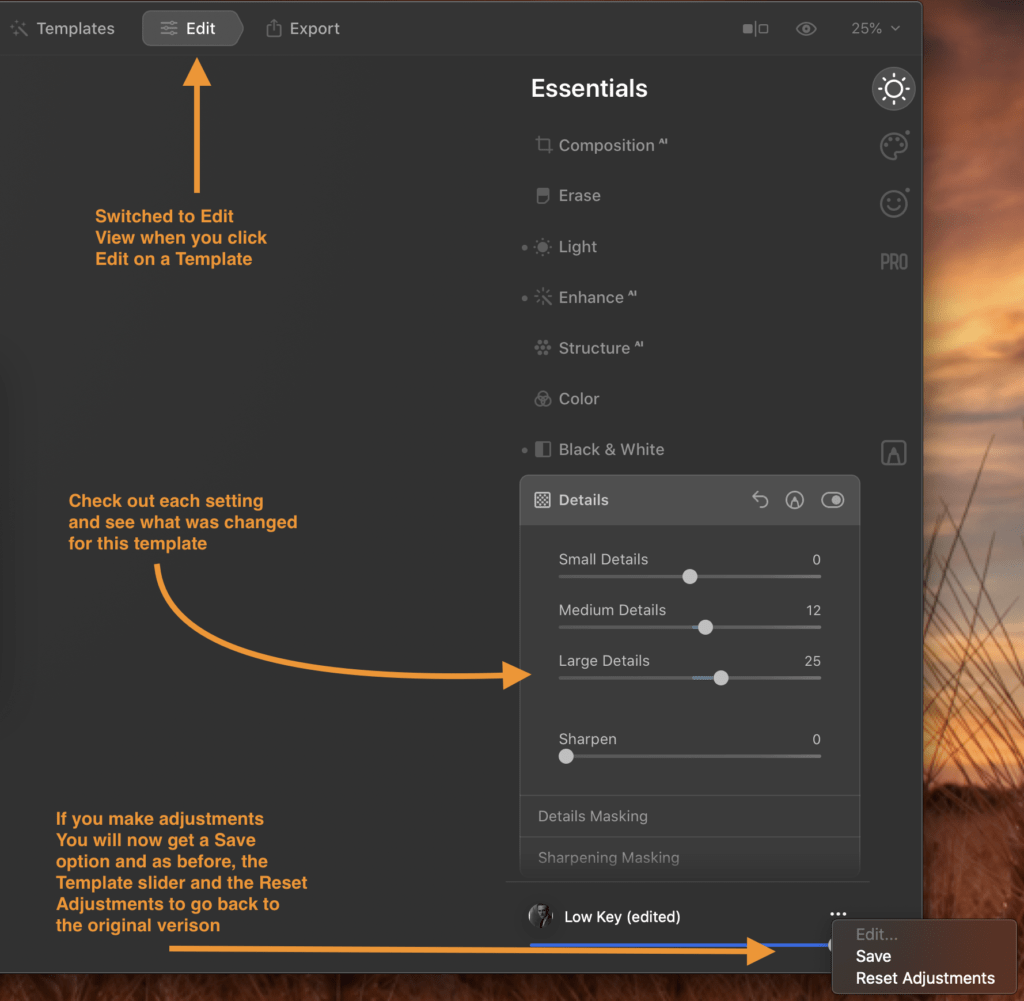
Editing a Template
Editing a Template’s settings

Now if you have made adjustments and really like the new look you have created and think you can use this on other images, you now have the option to save this base template with your adjustments as your own custom template. Note, the save button will only show up as being available if you have made your own adjustments. The name of the new template will be the name of the Template you used with the word Edit added. But if you go to the My Collection section and go to the User Templates section, you will now see your modified template saved in this section and you can rename it here if you want by choosing the menu on the right of the new User Template.
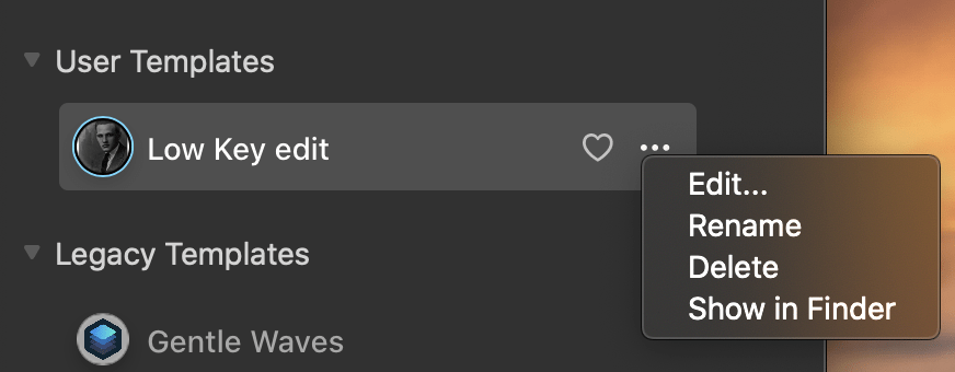
User Templates

We will get more into the whole editing section in Part 3 of the review.

My Thoughts on Templates

Part of the focus of LuminarAI is to make it easy to do things that use to take multiple steps or were complicated to do.

I think LuminarAI accomplishes this fairly well especially with the new AI template recommendation that is based upon it analyzing the your image and recommending which template to use. I think this recommendation is going to be very helpful to you especially if you start collecting templates. If it didn’t do this for you, you could end up going down a rabbit hole of trying to find which template may work best with your image. You could spend all your time picking a template instead of creating your work of art.. Just let LuminarAI make that selection for you and save some time.

If you are new to Photo editing, this feature will help you get the best out of your images without much work, but you don’t have to stop there. The templates are just a starting point. There is much more that this program can do for you. More on that in the Part 3 – Editing Review.

For me, I use the templates as a starting point. Either to give the overall picture a certain look before I go in and make minor adjustments, or to use as a base for creating my own custom template that I would apply to similar images.

How to update to or purchase LuminarAI

LuminarAI is offered in a couple variations as of this writing. There is a 1 Seat and a 2 Seat version.

What is meant by Seat? In short, each seat is each single installation of LuminarAI by device. So if you want to have LuminarAI on two computers you need to purchase the 2 Seat license.

LuminarAI 1 Seat – Cost is $79 before discount.

LuminarAI 2 Seats Cost is $99 before discount.

Don’t forget to use my LuminarAI Coupon Code of MARKDODD to save an additional amount when you purchase.

There is a 30 day money back guarantee from the time of shipping, which is currently set for December 15th, 2020; so if for some reason you are not happy, you can get your money back.

Please make sure your system is up to the task by checking it against the System requirements listed at the bottom of the product page. And yes, it does work with Mac OS Big Sur. But one note: LuminarAI is not yet been certified as of this writing with the new Apple M1 chip computers. I fully expect to be, but Skylum is still doing its testing on the new M1 chip hardware.


Be sure to check out Part 1 – The Catalog


Meet Luminar AI Banner

Luminar AI Review Part 1 – The Catalog

This review is based upon a beta version of LuminarAI, Skylum’s latest photo editor. As such some things may be a little different between the version reviewed and the final released version.

I have been a long-time Skylum customer, back even to the MacPhun days, and as such, I have seen their programs evolve over time. Some things I agree with, some I do not. I hope this to be an unbias review of their latest program LuminarAI.

What LuminarAI is and What it is not.

This is NOT an upgrade/update to Luminar 4. Despite having the base name, this is an entirely new program. Instead of just patching things in Luminar 4, Skylum made the decision to start from scratch with this new program. They, I believe, have taken the best of all their previous programs and some they acquired to make this new Photo editor that combines everything into one application.

This is NOT a cataloging program, aka DAM (Digital Asset Manager). Although you can view your images in what they have labeled a Catalog, in my option, this is more of a browser than a catalog. My view of what a catalog is is something that lets you tag, keyword, label, or add other metadata to your image. LuminarAI does not do this. There are many other programs that can serve this function well, those include Adobe Lightroom, On1, Capture One, ACDsee Photo for example.

Some initial comments

LuminarAI is intended to be a program for everyone. It has been designed for the beginner photographer and has options to add that level of user improve their image using AI but it also has the full set of tools a more advanced photographer would want to make more finite adjustments.

As part of this, LuminarAI is taking advantage of AI (Artificial Intelligence) that will analyze your image and make adjustments with little effort on your part. This seems to be a trend in photo editors, the AI bit, and I see this as becoming the norm for all photo editors. More to come on this in the part 3 review post when we get into editing.

In order not to have it be one very long post, I’m breaking it down into several parts. Part 1 will start out with the Catalog, Part 2 will be Templates, Part 3 will be Editing/Exporting

The Catalog

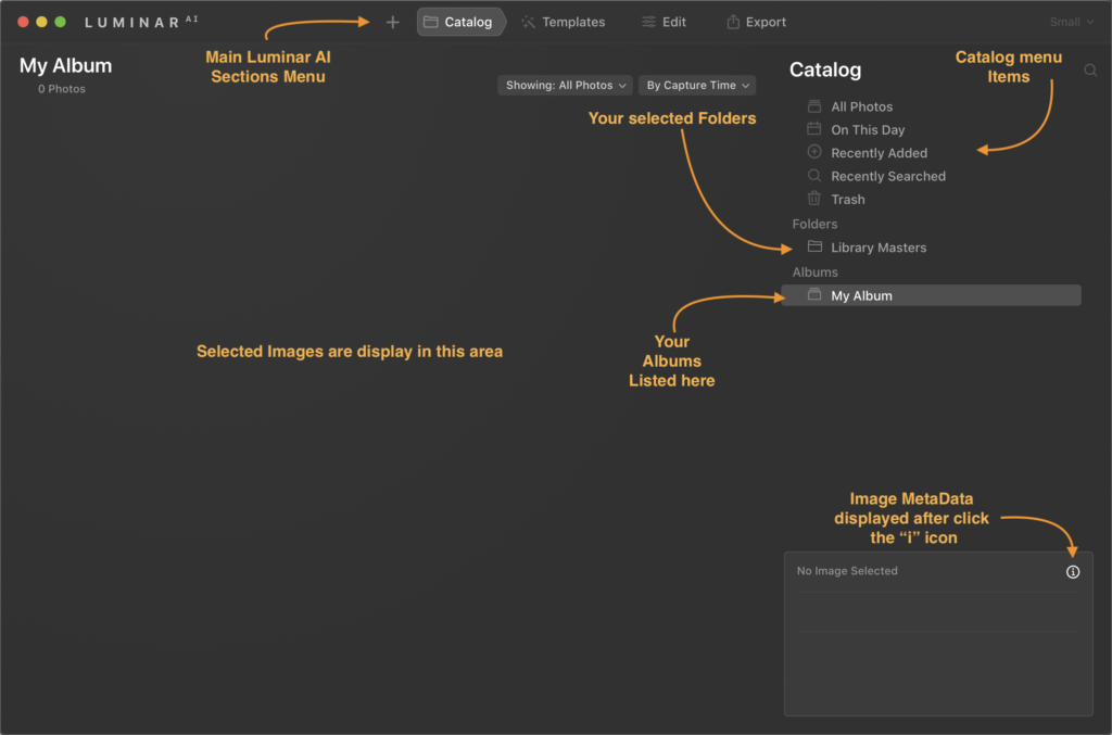
The Catalog in LuminarAI is quite functional for its purposes of letting you view your entire photo library. This is the view you are brought to when you open the program.

For you Luminar 4 users, important note, it does not open/convert your Luminar 4 catalog. When you open LuminarAI for the first time, it will ask you to locate your images so that it can create a fresh catalog of all your images. So, this is a bit of a repeat step but is necessary as they have written the catalog file to improve performance. At first, I thought this would be a bit deal, but after thinking about it what would I rather have done, have a new catalog that is much faster at responding and have to create my Albums from scratch, or have my albums with a slower catalog view. I’d take the faster catalog,

It has default items of All Photos, On this day, Recently added, Recently Searched (although this will only show up after your first search), and Trash (contains items you have trashed in LuminarAI, but they are not yet deleted from your physical photo library). Items are added when you select Move to Luminar Trash on any image.

There is a Folder section that shows what folders you have added to LuminarAI for it to show in your Catalog view. This folders section can contain 1 or many folders, and if you subfolders, you can expand the top-level folder to show those subfolders. The Albums section is where you can create your own Albums to help you organize your images locally or any other way you would like. It doesn’t physically move the image on your computer but lets you group images together in any way you would like.

It has a built-in search function that does let you search but image or folder name, date, or extension to help find your images wither they be in a folder, Album. Once you have found your image, you can see a bit more metadata of the image by clicking the little “i” icon on the bottom left of the Luminar window to show basic metadata information about the image, such as filename and extension, the ISO, Focal length, EV, F stop, and the shutter speed of your image; the date/time, dimensions, and file size of the image; and lastly the device it was taken on including the lens.

The interface

How to update to or purchase LuminarAI

LuminarAI is offered in a couple variations as of this writing. There is a 1 Seat and a 2 Seat version.

What is meant by Seat? In short, each seat is each single installation of LuminarAI by device. So if you want to have LuminarAI on two computers you need to purchase the 2 Seat license.

LuminarAI 1 Seat – Cost is $79 before discount.

LuminarAI 2 Seats Cost is $99 before discount.

Don’t forget to use my LuminarAI Coupon Code of MARKDODD to save an additional amount when you purchase.

There is a 30 day money back guarantee from the time of shipping, which is currently set for December 15th, 2020; so if for some reason you are not happy, you can get your money back.

Please make sure your system is up to the task by checking it against the System requirements listed at the bottom of the product page. And yes, it does work with Mac OS Big Sur. But one note: LuminarAI is not yet been certified as of this writing with the new Apple M1 chip computers. I fully expect to be, but Skylum is still doing its testing on the new M1 chip hardware.

LuminarAI Review Part 2 coming soon


Mass Watermark Logo

Review of Mass Watermark

Have been given the opportunity to review Mass Water Mark for Mac and Windows OS. Disclosures: I have been given access to the software, but other than that I have no affiliation with the software vendor.

I’m not one to usually watermark my images and I will not get into that debate here as to why or why you wouldn’t want to watermark your images. But for those that do and need an application to watermark your images, this may be your solution, especially if you are a Windows user.

Features and notes on each platform version

The features vary between the Mac OS and Windows versions at the moment with the Windows version having the full feature set.

Windows Features

  • Add Text or Image Watermark to a collection of Images
  • Batch Resize Images to meet Web standards
  • Retouch your Images before Watermarking with Image Optimizer
  • Create your own Branding Watermark with Custom Text and Custom Logo
  • Image Optimization – Adjusting Contrast,Brightness etc
  • Direct upload to Picasa or Flicker
  • Add EXIF information
  • Watermark Designer built-in
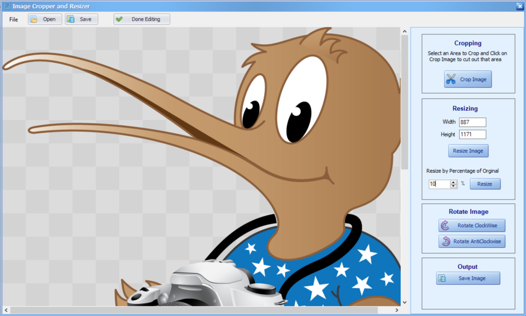
  • Crop/Rotate/Resize the image and the image for a watermark
  • Create a Zip file.
  • Improve Image Quality by applying effects like Mean Removal,Sharpening Etc
  • Can export the watermarked image as jpeg, png, bmp, gif, or tiff. It does have an option for the original format if you want to keep it the same as the imported image.

The windows version of this app is full-featured app for creating watermarked images as well as a way to mass resize images. It can import jpeg, png, bmp, gif, or tiff images.

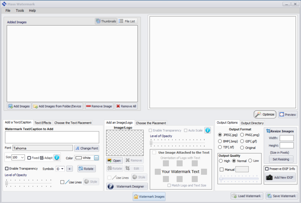
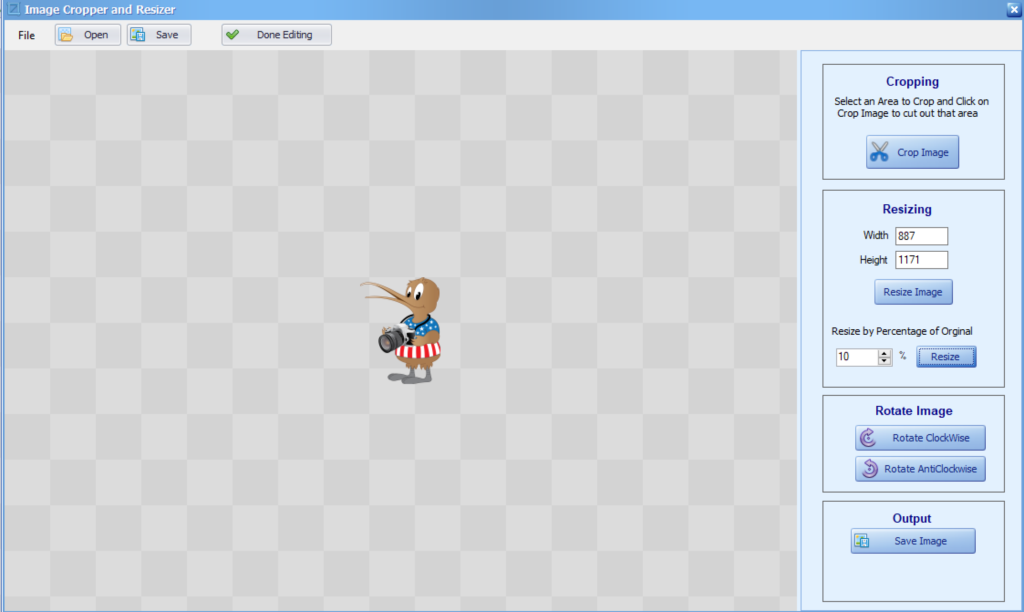
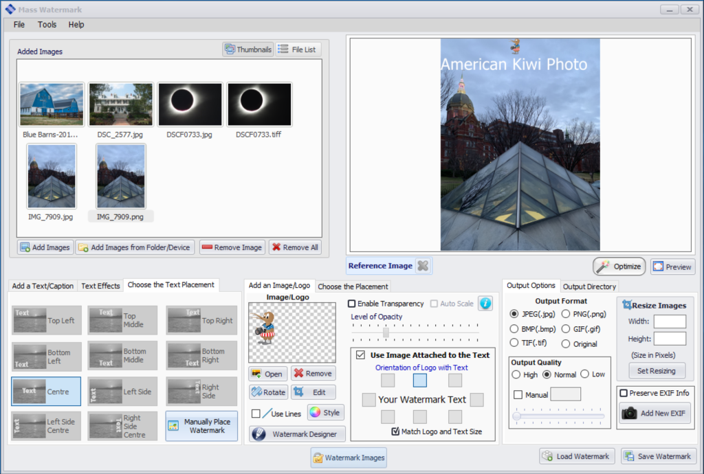
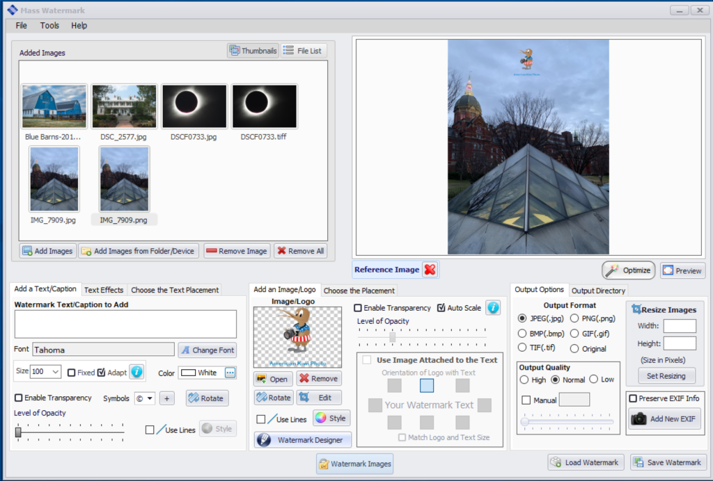
Below is the Mass Watermark interface. You have quick access to all the features in this one interface. The top left is where you import the images to be watermarked, the top right shows a preview of the selected image with the watermark. The bottom half is where you enter your text, image logo, and choose your various options

Windows Mass Watermark app interface

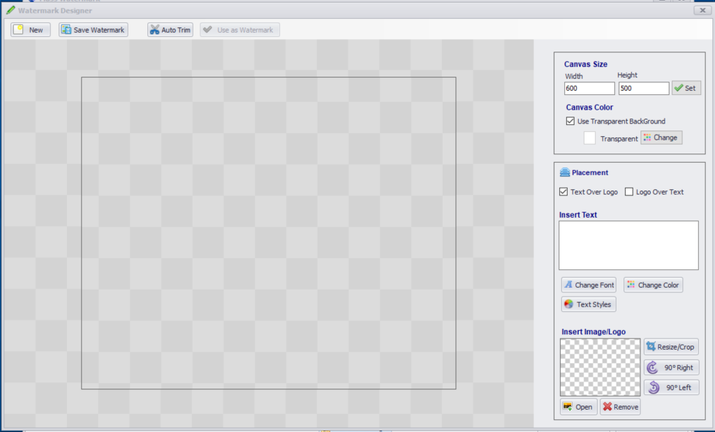
Below is the Watermark Designer interface where you can make your custom watermark with text, logo, or both and resize the logo image if needed. It lets you select the font size, type, and color and you can set options such as have the logo appear overtop of text. Once you have created your watermark, you can bring it right into the app or save it to bring into the Mass Watermark interface as a logo.

Watermark Designer Interface

Since my logo is usually a large format image I needed to scale it down and the Watermark Designer handled this very easily.

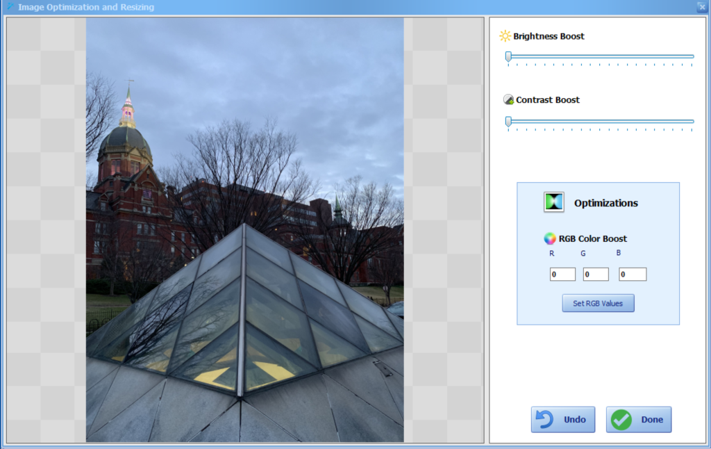
Another option under the top right section is the ability to do a quick optimization of the image. Below shows the basic editing options you can do with this app when you click Optimize.

Now that I’ve created my watermark with the Watermark Designer I have brought it into Mass Watermark and showing a preview of a watermark on which I added text and a logo. It is showing large and not transparent for easier viewing as an example.

Interface showing text and logo watermarks

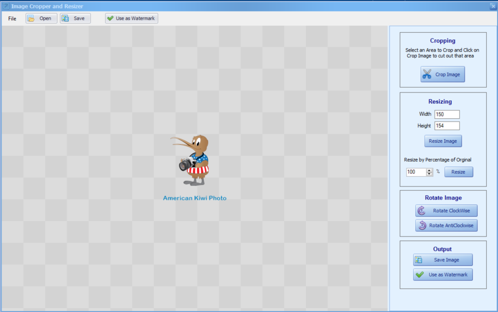
Watermark Designer to create a custom watermark with a logo and customized text. I did save it for future use, but if you click the use as watermark and you will be sent back to the Mass Watermark interface and see it as a preview of one of your current images. If you choose to save it, to use it in future watermarking, you would choose the save image in the open image logo section to bring it back in. Here is an example of a custom watermark created with the WaterMark Designer.

Now in this is the interface showing the custom watermark that I created above with the Watermark Designer. Once it is in the Mass Watermark app and you want to move its location, you can double-click on the preview and it will present you with another window where you can click and manually move the watermark’s location. You could also use the logo positioning options to autosize the image, make it transparent, and choose a position. Keep in mind that the location applies to all the images you export. So take that into consideration when you position it and when you are creating it. For example, in my sample images, if I had chosen the black text for my solar eclipses images you would not see the text.

Once you have set all your options and positioned your watermark, just click the WaterMark Images button. You will be prompted on where you would like to save the watermarked images via a standard windows dialog box. Selection your location (I recommend creating a new folder) and away the program goes rendering your watermarked images. Below I show one of my images with a custom watermark. Again, I left it large and none transparent for easier viewing as I would make the watermark smaller and transparent as not to take away from the image.

Example Watermarked Image.

One note: as in my example above I have the solar eclipse image as both a jpg and tiff image in the import folder, the program is smart enough too realize that this is the same image and when applying the watermark and saving the resulting images, it only saved one version of this image. This can come in handy if you have a folder of images that you are bringing and you didn’t realize you have multiple formats of the same image

The Windows version of Mass Watermark is a fully featured program that lets you create custom watermarks, position them, and apply them to as many images as you want. If you are looking for an easy way to do this and are Windows users I can recommend this program-

Mac Features

  • Add Text or Image Watermark to a collection of Images
  • Batch Resize Images
  • Create your own Branding Watermark with Custom Text and Custom Logo
  • Can export the watermarked image as jpeg, png, bmp, gif, or tiff. It does have an option for the original format if you want to keep it the same as the imported image.

The Mac version is missing most of the features you find in the windows version. It does function as a mass watermarking and resizing app with some caveats mentioned below.

It can import jpeg, png, tiff formats. It does not import HEIC format which is one of the formats from your iPhone. You will have to convert it to regular jpeg first.

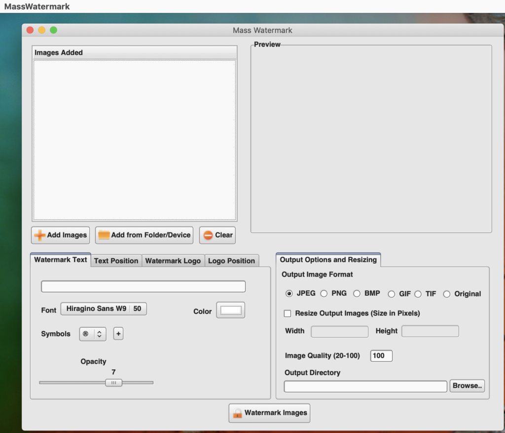
The interface is rather dated and it does have some limitations such as you cannot resize the window to take advantage of your larger screen sizes. This is still version 1.0 and was written in 2015.

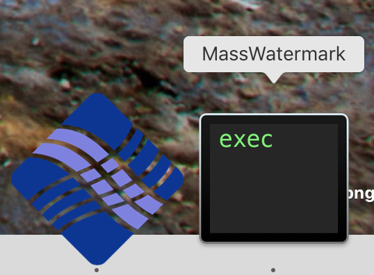
I have been testing it under Mac OS 10.14 and it does run. It will open two applications, one is the Mass Watermark app that has the app menus and the other is the interface showing up as MassWatermark. This does make things a little confusing. Shown below are the two dock icons that show for this app and the Mac Interface.

As with the windows version, you can enter your custom watermark text, change the font and size of the text, choose the placement of the text, select a watermark logo image, and place the position of the logo image.

If you are going to use an image for your watermark, you will have to resize the image outside of Mass Watermark before you bring it into the app. If not, depending upon the size of the image, it may fill the image with your watermark depending upon the resolution of your watermark image and the image you are watermarking.

To enter your license key in the Mac version it is not obvious as there is not a menu option, you have to open the app then click the close button on the interface app and you will get prompted with the below dialog where you can enter your license key, buy the app, or quit the application.

On occasion, I have had and issue with some of the menus in the menubar of the application disappearing, but if you quit and reopen the app they come back. This is a 32bit app, so mac OS 10.14 will be the last version that can run this application as with the next version of Mac OS you can only run 64bit applications. I have been informed by the vendor that they have plans to redo of the software and I expect it will get the same features as the Windows version and be compatible with the current Mac OS at that time.

In short, though, I cannot recommend the Mac version as a whole, but if all you want to do is a text or image watermark it may work for you. I would recommend waiting on the new release when it comes out.

There support section has a complete video library on how to use all the features for the Windows Version

Price as of this review is $30

light tent

Review of the LimoStudio 16″ x 16″ Table Top Photo Photography Studio Lighting Light Tent Kit in a Box

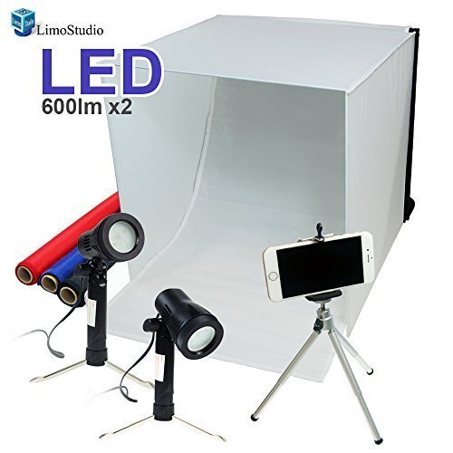
The LimoStudio 16″ x 16″ Table Top Photo Photography Studio Lighting Light Tent Kit in a Box,  Model AGG349


I was looking for a way to photography items that I am posting on eBay and didn’t want to spend a lot of money to get a professional lightbox. This item fits the budget coming in at around $40.


The kit comes with everything you need for photographing smaller items.


This is what comes with this light tent:

  • Contents: 1 x Mini Stand Tripod / 1 x White Photo-shooting Tent, 16-inch Cubic with Color Backdrops / 2 x Table Top LED Light / 1 x Cellphone Clip Holder
  • Red, black, blue, white backdrop fabrics included
  • LED light stand specifications: 5500 Kelvin / 600 Lumen / 120° Beaming Angle / Maximum Height, 9.5-inch
  • Table Top Mini Camera Stand: Height adjustable with max 8-inch tall / 1/4-inch standard screw tip
  • Cellphone clip holder is compatible with any smartphones


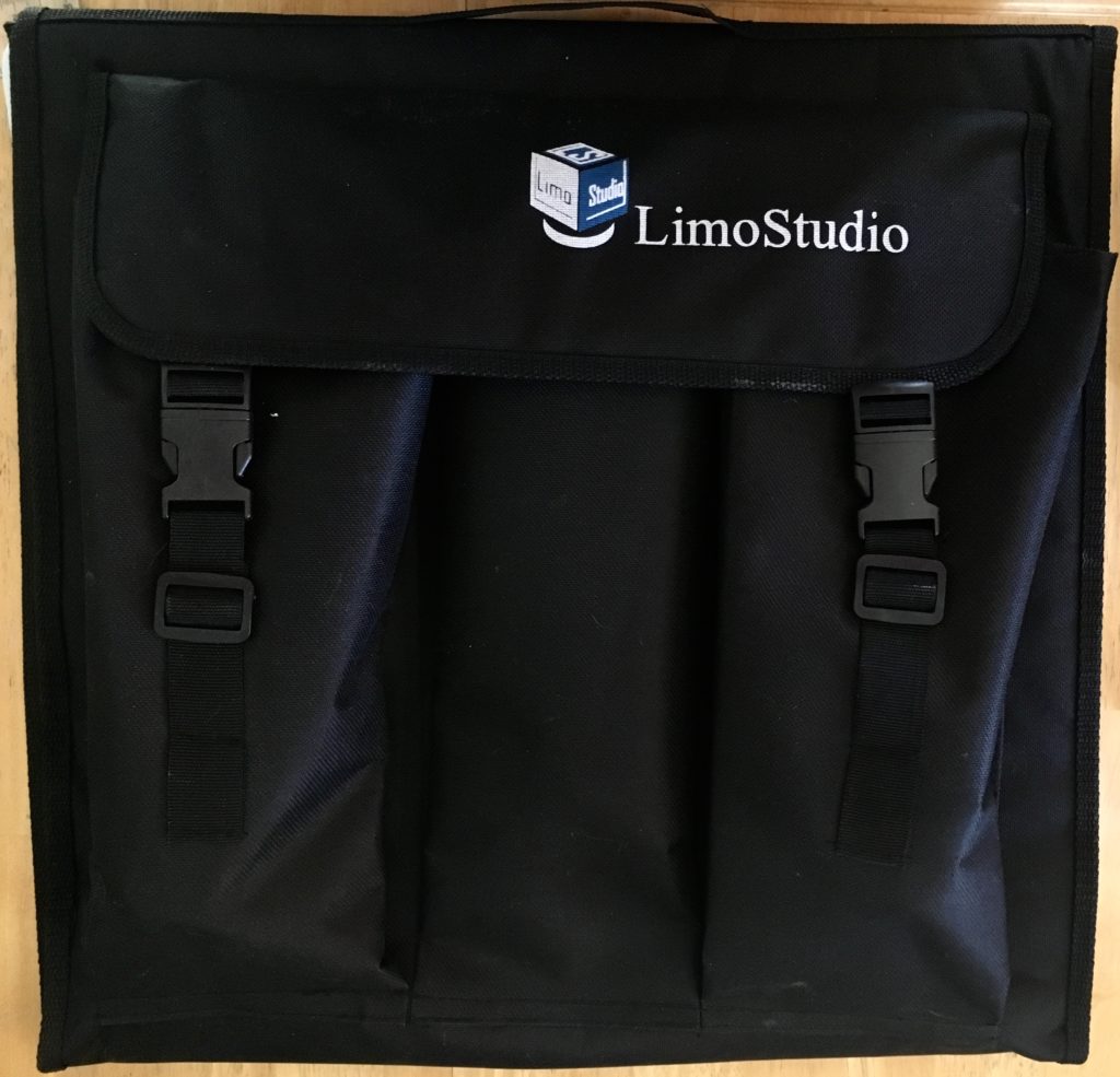
The kit folds down flat

It as two pockets the outside in which you can store the lights and the tripod with the clip. The extra backdrops to not fit in the pockets, but you can put them under the straps or just carry them separately.


Light Tent Folded


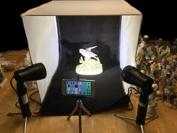
Here is the light tent all set up on my table and ready to start.

It is easy to unfold and put together. The top is attached to the side with a velcro strip. Not really shown in this picture, but the side may not lay exactly flat against the surface you place this on but does not hinder taking pictures in any way.

Light Tent Setup


The two lights have built-in tripod legs that will folder up into the light base for storage. Each light has its own on/off switch and is easily movable to get the angle that you need

One note not on the description on Amazon, but indicated in the manual that came with the product is that you should not use the lights for more than an hour at a time.

The phone tripod and clip are very basic but work for most phones. You will likely have to tighten the adjustment screw a few times as it not the best at staying tight especially if you angle your phone. You don’t have to use the tripod setup as the scene will be bright enough for you to handhold your phone or camera to take the picture.


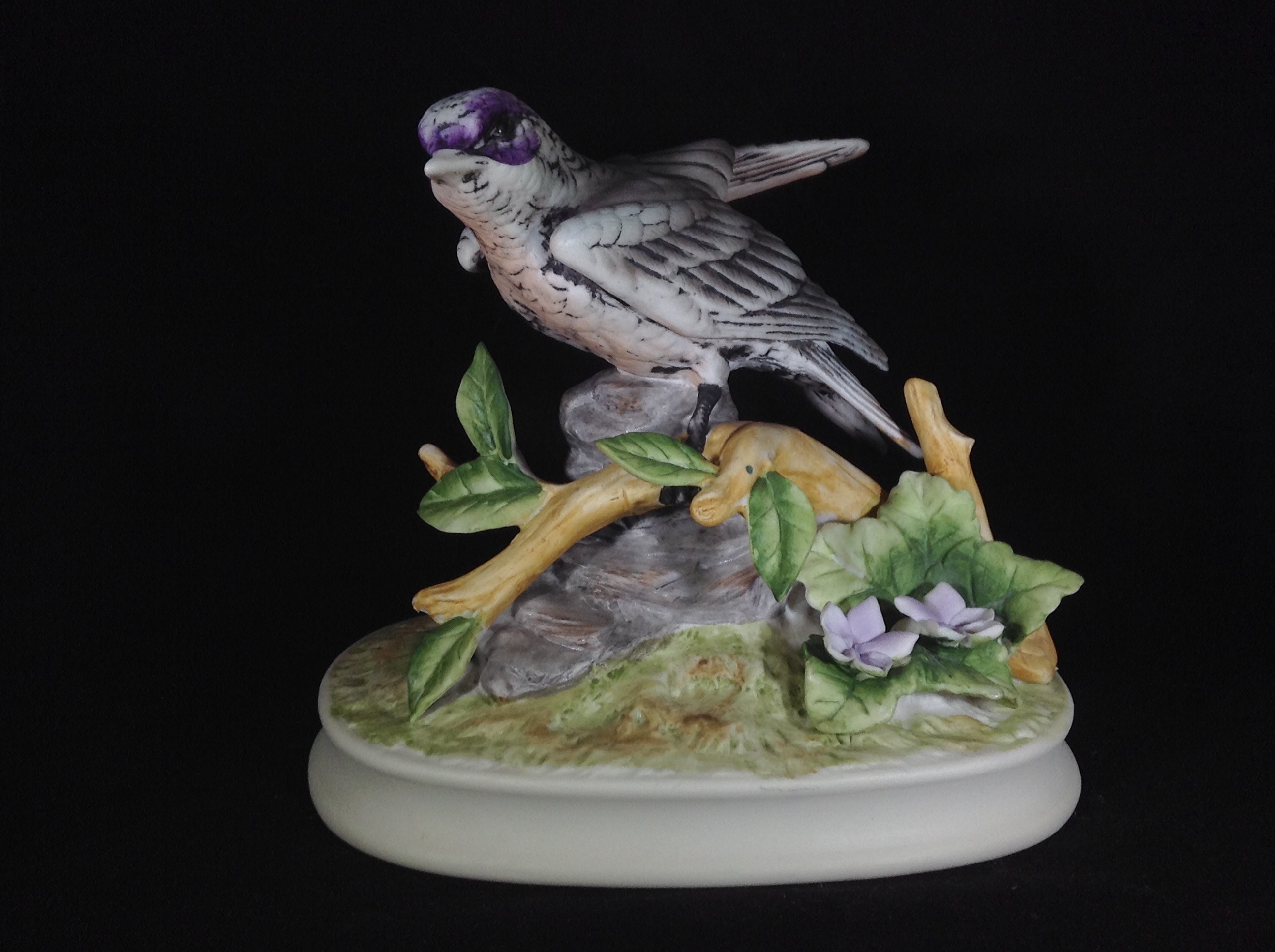
Here is a sample image

I took this with my iPod and is the item shown above in the light tent. This is straight out of the iPod before any adjustments that need to be made. But for the most part, no adjustments other than cropping and maybe a little shadow boosting.

Light Tent Sample image


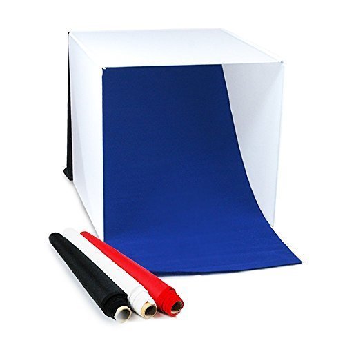
Stock view of the panels included.

They are what I call fake felt panels that have velcro attached to one end so you can attach them to the back of the Light Tent. Due to the material, the one drawback of these panels is that they like to collect dust. So try to use this product in a dust free environment. If they do get dusty, your standard lint roller will clean the backdrops just fine.

Light tent stock view of panels


In summary:

For the price, I couldn’t ask for anything more. The lights are bright and you have a selection of the three colors as backgrounds that look good for most objects.


You can get this item from Amazon


#amazon #affiliate #lighttent #Review


Review of Macphun Intensify CK and a Special Deal.

Review of Intensify CK from Macphun

I’ll get the basic information out of the way first before getting into my comments and review. First, this is a Mac OS only application. Sorry my Windows followers, but if you are looking for something that does run on Windows, I would check out On1’s Photo 10.5

The Intensify CK System and Software requirements

  • Mac OS 10.9 and above
  • iMac/MacBook Pro/ MacBook Air/Mac Pro/Mac Mini late 2009 or later
  • 4GB RAM and more
  • 512 MB Graphic RAM and more
  • Creative Kit is integrated as plugin with Lightroom 4,5,6 and CC; Photoshop Elements 10-14 (App Store version is not supported due to Apple Sandboxing); Apple Aperture 3.2 or later; Adobe Photoshop CS5, CS6 or CC 2014, СС 2015, СС.
  • Photos extensions support – for 10.11 only


Intensify CK Pricing

List price is $59.99 for the standalone application. (Look for a special limited time discount at the end of this review) You can also get it as part of the Creative Kit. There is a version of Intensify in the Mac App store, but it is a scaled down version and does not include the Plug-in support as mentioned above. To get the full features of Intensify CK you need to purchase it direct from Macphun.

Intensify CK feature set.

  • Real-Time Image Processing Engine!
  • Standalone software & Plug-in Support
  • Native 16-bit RAW Processing
  • Social integration: Facebook, Flickr, etc.
  • 68 Professional Presets
  • Advanced Structure and Micro Structure controls
  • Layers & Masking
  • Proprietary Technology for Revealing Details
  • Vignette with Custom Center
  • Proprietary Technology for Pro Contrast
  • Powerful Macro Sharpness
  • Built-in Macphun Print Lab


Now on to the review and my comments on Intensify CK

Continue reading “Review of Macphun Intensify CK and a Special Deal.”

Review of Becoming An Artist Season 1

Becoming An Artist Season 1 with Trey Ratcliff of StuckinCustoms.com

Preface

First I must say I do my best to be unbiased in all my reviews, but in this case I must disclose that I’ve been following Trey Ratcliff for years and as such I”m am a big fan so this review might be a little unintentionally biased. I’ve followed him for so long that I seen changes in his website, changes in his photography equipment, and the ever evolving changes and improvements in his photography. I’ve seen him go from a one person show to a multi artist show, to a worldwide show, and now to Facebook live. I’ve seen his business constantly expanding with new and exciting products and adventures. I also had the pleasure of meeting him in person on a photo walk he and the Stuck in Customs crew did last year in Philadelphia and Washington DC. If you want to see what that was like visit tour.treyratcliff.com

That said, let’s get to the review.

Becoming an Artist Series 1 is comprised of 15 episodes. Each episode is about 30 mins long and divided into two sections. In the first section of each episode you hear Trey tell personal stories such as a bit of his life history, how he became a photographer in his 30’s, and some of the things that inspire him in his photography and art. I believe he does this to give you a sense of where he’s coming from, how he sees the world, and what affects this has on his photography. There is some dialog just about art in general and how other art can help influence or inspire your photography. He will discuss the picture(s) he is taking at that time, why he choose to take that picture, and some tips about the picture including composition, color, light, and inspiration.

In the second section of each episode you get transported to Trey’s Studio in Queenstown New Zealand, where he will show you his editing techniques on some of the photos he took during the previous section using various tools from PhotoMatix, Lightroom,  Photoshop, and other tools like Autopano Giga for his panorama’s. He shows you basic techniques up to some very advanced techniques.

Episodes have interesting titles like

  • Episode 1 – The Accidental Creation of Me
  • Episode 6 – Writing a Failed Novel
  • Episode 10 – A Reccy to Chernobyl
  • Episode 14 – A Street Fight in Morocco

So you can see this is not your typical tutorial series.

This series was created before Aurora HDR came out, so for this season he doesn’t use his new tool, Aurora HDR Pro, which he co-developed with Macphun software.
In addition to the video series Trey has created a Facebook group “Becoming and Artist – Trey Ratcliff’s Funky Lounge” where you can post your own work and interact with fellow artists.

Continue reading “Review of Becoming An Artist Season 1”

Review of Nowvel

My Review of Nowvel and a few tips of an iOS app for printing photo books on your iOS devices such as a iPhone, iPad, or iPod touch.

Through a recent promotion I was introduced to a iOS application that will take your iPhone, iPad, iPod touch photos, Facebook photos, or Instagram photos and create a 20 page photo book with up to 100 photos.

This is my review and experience with that product.

The product is currently only for iOS devices running version 8.0 or later.

I’ve used it on an iPhone and on an iPad.  I’ve found it easier to use on the iPad just because things are larger and my eyesight is not what it use to be. It behaves the same on both devices. On both devices it is only in portrait view, which I can see on the iPhone, but I wish it would do landscape on the iPad.

Initially I found the app a little hard to use. Like a lot of apps these days there is no manual. Granted the younger generation that are use to mobile apps might would have picked it up a little faster than I. Once I figured the basics of adding, ordering, and editing photos I found the program very easy to use.

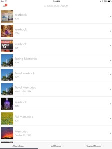
When you open the app you are sent to the Choose your Album of the Create a New Book menu.

IMG_0150

You can either choose one of their automatically created albums on the Album ideas tab or choose All photos or Tagged Photos tabs to start creating a custom book from your photos.

  • Albums Ideas – If you select one of the albums that were created by Nowvel it will take you to the images that they selected for this album and put you on the “Our Picks* tab that shows the pictures the app has picked for the book. You can select the photos from this list or choose one of the other tabs of “Just Faces” or  “All Photos”.
  • All Photos – You can select an album from your device, Facebook, or Instagram as the starting point for your new book. (Note you will see your iCloud Shared albums here, but do not use the those albums as a source as you either see no pictures available or it may show that most are too low of quality to print. There is a solution if these albums contain the photos you want to use and I give the steps below)
  • Tagged Photos – Shows photos that are tagged on your social media sites

Now how do you use photos that are in one of your shared iCloud albums and use it in Nowvel. Here are the steps I took

  1. Open the Photos app on your device
  2. Select the shared album that has the photo you want to use and open it to see the photos in the album
  3. Click “Select” at the top and tap each image out of this album you want to use. If you want to use them all, choose “Select All” at the top
  4. When you are done selecting the images, click the “Share” icon on the top left
  5. Click “Save Image” to have the selected images saved to the local devices camera roll.
  6. Open Nowvel if not already open and on the Choose Your Album page (on the Create a New Book section)
  7. Select the All Photos tab at the bottom and choose your Camera Roll Album
  8. You can now select the images you just saved to create your new Nowvel photo Book

If you have photos on your computer or took some with another device that you want to get into your Nowvel book and you are not using the iCloud Photo Library, just create a shared album in Photos on your computer and that shared album should show up on your device. Then use the method above to import them into your camera roll so you can use them in Nowvel. If you have enough iCloud storage and have the iCloud Photo Library turned on for all your devices then the creating of a shared library is not necessary as all your photos will already be on your device as part of that service. In my case, I do not have the iCloud Photo Library turned on as I have way more photos than my storage limit.

Once you select your images they are placed in your photo book in what I believe is chronological order by date/time and a layout is chosen for each page and you will be shown the current cover for your book. The number of images placed on each page will depend upon how many you selected, but you do need to have at least 20 photos selected before it will let you create your new book. Don’t panic if you don’t like the cover layout or any page layout as you can easily edit the book, just click the Edit Book on the top right.

You have 20 cover designs to choose from at the time of this writing and they seem to be adding more all the time. Most have some customizable text boxes on the front and back covers along with varying number of photos to be shown depending upon the layout chosen.

For each page you can Shuffle Collage to change the way the image or images are laid out on the page. You can easily add and remove images from a page, rearrange where they are located,  and add text to the page. Just tap the image to edit it or remove it. Any removed image will be put down in a little bar at the bottom of the page so it is available to put back or be placed on another page. Tap, hold and drag an image to move it to a different panel on the collage. Each image can be edited by cropping it to fit the collage panel, or enhanced the image a little, or have a filter applied to the image, or any combination there of. To add text to the page, click the Add Text button at the bottom, type your text, and click done. The text will be placed in the middle of the page. You can now change the color from White to Black, Change the Alignment, or change the font. Tapping each button will cycle through the options for that button, just like the Shuffle Collage does for the images.

I will note that if you add an image, remove an image, or Shuffle the Collage you will need to check any image that you had adjusted the cropping for as it would have been reset and you will have to redo your crop setting.

Once you have the layouts done, you can reorder the page order if you wish. When you are done editing, just click done in the top left or View My Photobook at the bottom.

Now you are ready to order your book. Just click Buy Book at the bottom of the page to get to the in-app ordering page where you will see your coin balance applied, choose the number of books you want ordered, select if this is a gift, enter shipping information, and enter payment information.

You can also Share your Photobook with Facebook, Twitter, Email, iMessage, or other service. You have the option to have your book featured on Nowvel’s Inspiration Gallery and make it available for others to buy. If they do, you earn a $1 coin for ever purchase.

The Nowvel Menu

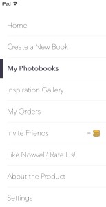
You can reach the main menu of the program by clicking the menu button of three horizontal bars on the tops left

The menu consists of the following options

Home , Create a New Book, My Photobooks, Inspiration Gallery, My Orders, Invite Friends, Like Nowvel? Rate Us!, About the Product, and Settings.
Whats in each section of the menu

Home – Here you can quickly see your coin total and have access to the basic menu options of Create a book, View my books, and see their inspiration Gallery

Create a New Book – Here you will see

  • Nowvel’s list of Album Ideas that were automatically created based upon your photos. So far it looks like they have done a pretty good job on my photos of grouping them by event or time period.
  • All Photos is where you can select up to 100 photos for your custom book from your device albums (does show your iCloud Shared Albums here, but as I mentioned above you only want to select photos from the Camera Roll or Albums created on your iOS device), Facebook, or Instagram.
  • Tagged photos from Facebook, or Instagram.

My Photobooks

  • Photo books you have created or selected from the Album Ideas list.
  • A “Nowvel for Dummies” which describe the features of their books

Inspiration Gallery

  • Where you can see Featured Books created by other Nowvel users

My Orders

  • Any order you have placed will show here along with the Order Date, Order Number, and Status.
  • You can also Track a Package (Once your book has shipped) and Re-order a Book the book easily from this page.

Invite Friends

  • Here you can invite friends from Facebook or Twitter and email or SMS a Friend.
  • Your friend will get $5 off their first book and for each book they buy, you receive a $5 credit.

Like Nowvel? Rate Us!

  • Takes you to the App Store so you can leave a review or rate the app

About the Product

  • A brief description of their product

Settings

  • You can enter any Coin Codes you receive here to have the coins added to this device.
  • Shows what services you have connected for sources of your photos, Camera Roll, Facebook, or Instagram.
  • Shows if you have enabled Notifications
  • A Contact option that automatically creates an email to their support address that will show your devices unique code. This is how they know you and this code is different for each device, hence each device being treated as a different account.
  • The privacy and terms of use.
  • And icons to follow Nowvel on various social media sites.

Coins – What are they and how do you get them and use them.

Coins are a way of paying for all or part of your Photo Book. There doesn’t seem to be a limit on how many you may earn. You can view your balance on the Home page.

You can earn coins by doing various tasks such as connecting Nowvel to your Facebook and Instagram accounts, Inviting friends to use Nowvel, and you may receive notifications on other ways to earn more coins.

You can use your coin balance to cover the cost of the book, but shipping is not covered by your coin balance. For example on my recent order of one book the total cost was $25 for the book including shipping. I had a coin balance of more than 20 coins so  the $20 cost of the book was covered by my coin balance and I only had to paid for the shipping of $5.

The Printed Book

I ordered my first book on the 22nd and it arrived on the 26th. So 4 days from time of order to arrival I think is pretty quick and it was sent via USPS so you can track the shipment along the way.

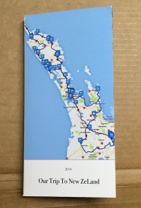
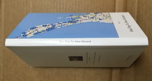
Here are some photos to show the book I received.


IMG_3814
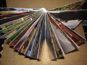
The book showing the cover. 4×8 inches in size

IMG_3815
The outside of the printed book showing cover, back cover, and spine

IMG_3817
Showing the pages and binding

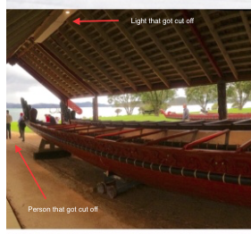
After getting the printed book I realized it is not quite what you see is what you get on the view shown in the Nowvel app. This is not a problem that is isolated to the Nowvel app but a lot of the photo printed book. That being you lose part of your image on the outer edges when you have photos on the edge.

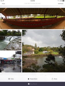
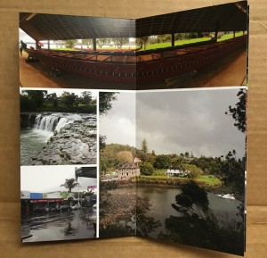
Below I show the full page and close up views of a page from my Nowvel book that shows how much is clipped from photos that are on the edge of the book. My best estimate is about 1/8 of an inch. [post review note: this was spelled out in their faq file and it is indeed 1/8 of inch]

IMG_0154
Page as shown in the Nowvel app on the iPad

IMG_3813
Page show as printed in the book

Close up of edge
Close up of the top left edge of the photo as shown in the Nowvel app on the iPad

Close up of printed edge
Close up of the top left edge of the photo showing where things were cut off in the printed book


Despite the edge cut off that I didn’t take in account for on a few images and not following my own advise with one image not being center, which were all my fault. I love how the book turned out and will be getting more.

Negatives I see at the moment.

Each device is treated as its own account and as such the coins you earn/enter and the books that you create are only on the device you earned/entered the coins on or created the book on . They are not transferable from one device to another at this time.

One BIG problem I had with the when I deleted Nowvel. If you delete the app from you device for whatever reason you will LOSE all of your coins. When you reinstall the app you will be back to the initial balance of $0. Luckily I still had my promotional notice and was able to have Nowvel support credit my device for the deleted coins.

Since the coins you earn are per device and each device is treated as its own account when you go to order a book you can only use the amount of coin credits you have on that device. It does not matter how many coins you have in total across all your devices. For example, if you have an iPhone with 4 coins and an iPad with 20 and you buy your book on your iPhone you can only use the 4 coin credit from your iPhone even though you had enough coins on your iPad to pay for the entire book.

The program crashed for me when I tried to add an address from my address book for the shipping address during ordering on the iPad. Seems to work on the iPhone, but it didn’t let me select which address of the multiple address I have listed, such as work and home, and it put in the first address listed in my contact card which happen to be my work address. So I’d say there are a few bugs still to be worked out, but I was able to add my address manually with out any issue.

In summary

I do think this is a great app. Once you get the hang of it is very easy to use.

The printed books are have a good solid feel to them and the photos look great on the thick paper pages.

I would recommend you decided which iOS device you are going to use with this app and then stick with just that device. For most folks I think this would be your iPhone anyway since that is the iOS device most use to take their photos. This way you have access to all of your coins when you go to buy your book. You will also have access to all of your custom created books.

I’ve contacted support a few times for some of my issues and they have been very helpful and I’ve gotten responses and resolution within a day in most.

This syncing of books and coins is something that I”m hoping they have in the plans for the future to make it more usable on multiple devices.

If the iPhone is your camera, then I would say this is definitely an app for you.

I would also recommend reviewing their FAQ at https://nowvel.com/faq.html as it gives a fair amount of information about the app.

If you are ready to make the jump, I can help you out a little with a $5 gift towards your first book. Just click on the image below.

nowvel
Click the above image to save $5 on your book

#Nowvel #Photobook #Review #Discount

Ace Rental Auckland Airport, New Zealand Review

First I have to say this one is a little overdue as I thought I had already posted this, but had not. So forgive the lateness.

After extensive online searching for the best price on a rental vehicle on my trip to New Zealand last May, I settled on renting from Ace Rental, Airport branch.

We booked very early in that I booked the People mover (Van for those in the US) back in Oct when our trip wasn’t until the following May and got the best rate out of all the rental agencies I could find for Auckland.

Booking online we easy and convenient. The only confusion I had been when I got the confirmation it showed as “Tourism Enterprises Ltd trading as “Ace Rental Cars””.

When we arrived in Auckland we called the Airport branch from their courtesy phone at the airport and they arrived in their shuttle van with a trailer for our luggage within 10 mins.

At the branch, the staff were friendly and got us squared away with the paperwork rather quickly. We did opt for the full insurance which I think made the paperwork go much quicker.

Now here is where I had the only problems.

After getting the paperwork done, they walked us out to check out the vehicle and walked up to a car, this was not what we had reserved as we had reserved a People mover (Van for those in the US)

I showed them my booking receipt and they apologized and we walked back in while they got the People mover ready.  We went out and checked out the vehicle, put our luggage in and drove off.  This vehicle had a problem right from the start in that at about 50K it had a horrible engine noise and no acceleration and then the check engine light came on.  We immediately took it back and after waiting another 10-15 minutes they got us another People mover for us and we drove off into the city without issues this time.

We were very happy with this vehicle and had no issues with it while on our trip. At the time of our booking, they offered AA (AAA for those in the US) roadside assistance, if you needed it, but we did not, so I cannot speak to that. But most Auto Associations have very good service.

I would recommend getting the full insurance, as many roads outside of the city have loose stone and can easily chip the windshield, which did happened in our case. That and you do not have to deal with the large hold on you card (what they call Excess and Bond)

When we returned the People mover it only took a few minutes to check the vehicle in and the shuttle to take us to the departure terminal was already there, so we when right off to the terminal.

Despite the minor problems, I would still recommend this company due to the value for the service.  The next closest competitor was at least $300 more and that was a similar service to Ace.  If you went with the name brand agencies I would have spent over $1000 more.

Also, these are late-model vehicles with higher mileage than you would find at a name brand agency, but that is how they keep their costs down. Since they are late-model vehicles, the might get lower gas mileage/kilometers that a newer vehicle, but I in our case the gas consumption was about the same as a newer model and thus didn’t justify paying the higher rental fee. The vehicles all seemed well cleaned and in good shape as I checked out several of the cars while we were waiting for People mover to become ready.

I would take a copy of your rental confirmation with you and do one thing that I didn’t, call or email the branch you are renting from the day before just to confirm your reservation. This way they should have the right vehicle ready for you when you arrive.

A People Mover rented from the Auckland Airport Ace Rental

Entrance to Ace Rental on Manu Tapu Drive
Entrance to Ace Rental on Manu Tapu Drive, just a few Kilometers from the Airport.

Looking for an App to help you pack, then I’ve got just what you need

Until this upcoming trip, I have only been traveling fairly close to home so I didn’t sweat it too much on what I packed. If I missed something, I always knew I could find it at a local Walmart.

This time I’m traveling internationally, so I started hunting for apps that could help with my trip.

I was looking for an app that could keep track of the items I had in each bag just so I didn’t forget anything when repacking them, how much each item weighed so I had a sense of how much my bags weighed since Airlines charge overage fees, and could create lists not only for me, but for my fellow travelers.

After looking around the App Store at free and paid packing list applications I finally decided on a paid application.

I ended up with Packing Pro by quinnscape.com

Packing LIst Pro
Buy in the App Store


This app meets my need and more.

I’m still exploring all the features, but so far one of its features I think has saved me.  It has an Expert Assistance feature that asked a few questions and helped generate a list of possible items for me to take from its Master Catalog list of packing items.  I used this to generate not only my list, but my daughters, who will be joining me on this trip.  Not being female, I do not think of all the possible things that they may need to take with them, this program helped me give them a starting list of things to consider packing, of which many I would never have thought of.

It even gives lists of things that you may need to do before you even start packing.

This is just one of its many features, I would recommend it to anyone. Before you buy this modestly priced app, visit their website as they have a much more detail description.

As of this writing, this is an IOS only App and is $2.99 as of this posting for the pro version, which I think is a steal for this app.